Portfolio ✦ 2026

Share a brief

← All work

NOVA Cacao

Nova

Bright ritual. Real cacao.

Client

NOVA Cacao

Role

Brand identity, packaging & digital

Timeline

6 weeks, 2026

Team

Independent project

Status

Launched

Nova 3D campaign board

The mess

A pouch with presence

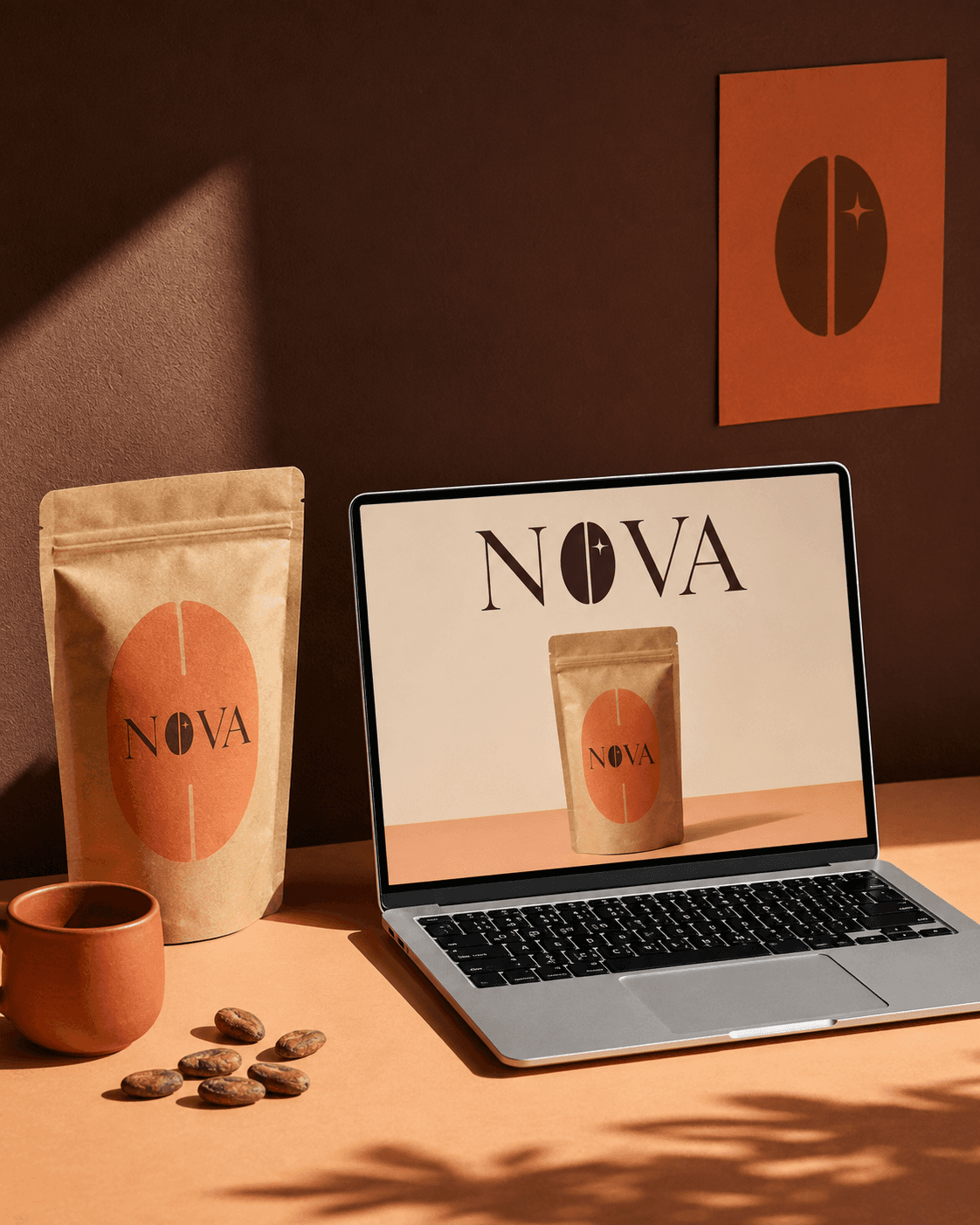
The packaging leads with texture, not polish. Kraft paper gives a human, ingredient-first feel; the oversized coral label makes it impossible to miss.

The marker work

The bean becomes the mark

The NOVA O is built from a split cacao bean and a small star. It gives the brand one asset that works on packs, cards, screens and large posters.

The payoff

From shelf to scroll

We carried the same warmth into the online store: clear product focus, rich material details and a system that makes the ritual easy to enter.

04

Pouch formats

01

Signature bean mark

06

Brand touchpoints

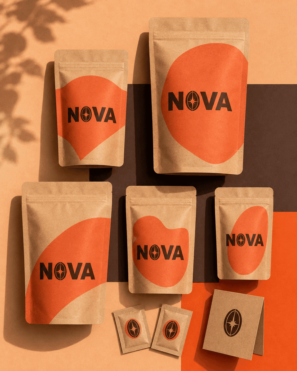
four formats, one mark

Make the ritual feel bright, not precious.

NOVA Cacao

·

the brief

packed, poured and put out into the world

Built for the shelf, the screen and the street

Built for the shelf, the screen and the street

the key visual, render 47

the product family: one simple pouch structure, scaled into a full cacao range.

colors tested on stage light

the digital store: a warm, focused e-commerce experience built around the product.

abstract set, act II

the daily pour: a product ritual shown through real texture, warmth and movement.

real texture, warmth and movement

environment plate

made to be seen outdoors: the core pack becomes a bold poster without extra noise.

the sculpt that started it

a flexible packaging system: size, label shape and colour shift without losing the brand.

the calm shot for print

worth opening: packaging, tissue, card and scoop turn a delivery into a brand moment.

the key visual, render 47

the product family: one simple pouch structure, scaled into a full cacao range.

abstract set, act II

the daily pour: a product ritual shown through real texture, warmth and movement.

real texture, warmth and movement

the sculpt that started it

a flexible packaging system: size, label shape and colour shift without losing the brand.

colors tested on stage light

the digital store: a warm, focused e-commerce experience built around the product.

environment plate

made to be seen outdoors: the core pack becomes a bold poster without extra noise.

the calm shot for print

worth opening: packaging, tissue, card and scoop turn a delivery into a brand moment.

the key visual, render 47

the product family: one simple pouch structure, scaled into a full cacao range.

the sculpt that started it

a flexible packaging system: size, label shape and colour shift without losing the brand.

environment plate

made to be seen outdoors: the core pack becomes a bold poster without extra noise.

abstract set, act II

the daily pour: a product ritual shown through real texture, warmth and movement.

real texture, warmth and movement

colors tested on stage light

the digital store: a warm, focused e-commerce experience built around the product.

the calm shot for print

worth opening: packaging, tissue, card and scoop turn a delivery into a brand moment.

got a messy idea?
perfect. bring it.

heymira@design.com

© 2026 Mira Kim ✦ Designed with curiosity

Create a free website with Framer, the website builder loved by startups, designers and agencies.